Previous: TOMS Satellite Data Next: Constraining Acceptance Criteria Up: Ext. Abst.
Comparisons with Daily Overpass Data
The collocated satellite overpass data were merged with cross-calibrated ground based data from the four sites.
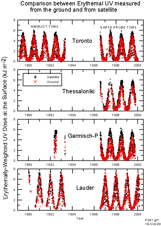
Figure 1 shows the period of coverage, and compares the daily does of erythemally weighted UV. Doses are greatest at Lauder, and while there is good agreement between satellite derived UV dose and measured UV dose at Lauder New Zealand, at the Northern Hemisphere sites the measured doses are significantly less than those retrieved from the satellites.
Figure 1. Comparison between satelite-derived erythemal UV and ground based measurements.
Figures 2 shows detailed day to day variations over shorter periods during the summer. The satellite-derived UV shows a remarkable ability to model the effects of cloud changes in daily integrated UV dose from a single observation per day. However, there can be notable outliers.
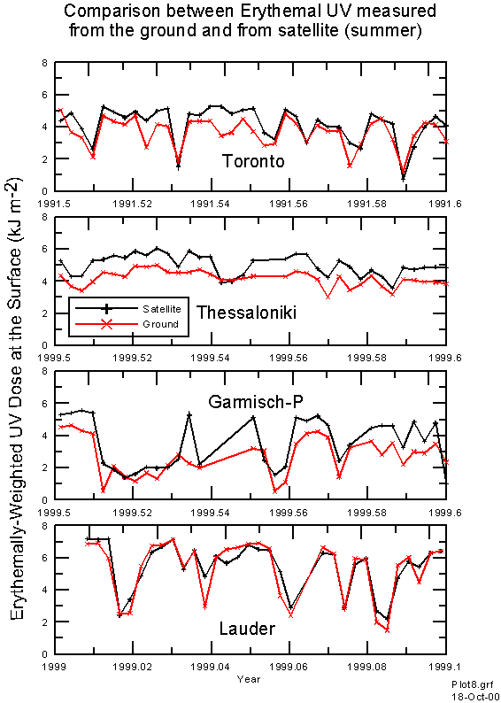
Figure 2 Comparison between satelite-derived erythemal UV and ground based measurements over a summer period.
Figure 3 shows scatter plots of satellite-derived erythemal UV versus measured values for the four sites. Despite the similarity in latitude, the measured doses for Lauder are much greater than at the other three sites. Again the systematic differences noted previously can be seen. Differences between satellite-derived UV and measured UV can be large. The spread of deviations is noticeably smaller for Thessaloniki. It appears that day to day cloud effects may be smaller here. This is also the only region which remains snow free all year round.
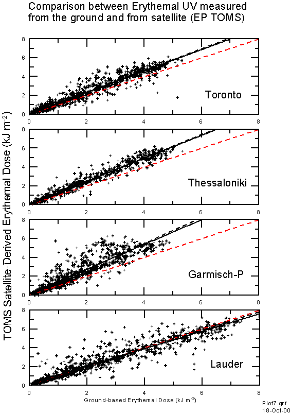
Figure 3. Scatter plot of TOMS-derived erythemal UV dose versus ground based measurement. The red line is the ideal. The dotted black line is the regression through the origin, and the solid black line is the best fit linear regression.
The Lauder site appears to show greater variability from day to day which is not always captured by the satellite data. This may be because of peculiarities of the measurement site which is located in a valley with very low rainfall, but with regions of much heavier rainfall surrounding the site (especially to the West). While at some sites, the fractional cloud cover in a satellite image may be an accurate representation of the average cloud cover over a particular site within the scene, this is not the case in Lauder.
We investigated the sensitivity of the regressions as functions of the parameters available in the TOMS overpass data (e.g. SO2 index, ozone, aerosol index, reflectivity, sza, surface pressure, collocation error). Generally the sensitivities were small. However, the error between satellite-derived and ground-measured UV did show a possible dependence on satellite footprint pressure. At Lauder there is a suggestion that errors are larger at lower pressures. There are two possible causes for this:
Histograms of the satellite footprint surface pressure are shown in Figure 4. They show that at Garmisch-Partenkirchen there is a wide range of pressure differences and the mean surface pressure is approximately 60 mb less than at the observatory mean pressure of 930 mb. This corresponds to altitude discrepancy of ~300 m, which could be responsible for systematic differences in UV of a few percent, since in Europe, altitude sensitivities of ~20 percent per kilometre have been reported [Blumthaler et al., 1997; Seckmeyer et al., 1997]. However it had been shown that the dependence on altitude cannot be described by a single number, but is a function of season, albedo and air pollution [Seckmeyer et al., 1997]. Similar differences in pressure are observed at Lauder, but since aerosol extinctions are small at this site, we can be more confident that the altitude difference does not lead to a significant error. At Toronto and Thessaloniki, the pressure differences are small. At all sites, the pressure differences show little sensitivity to these selection criteria.
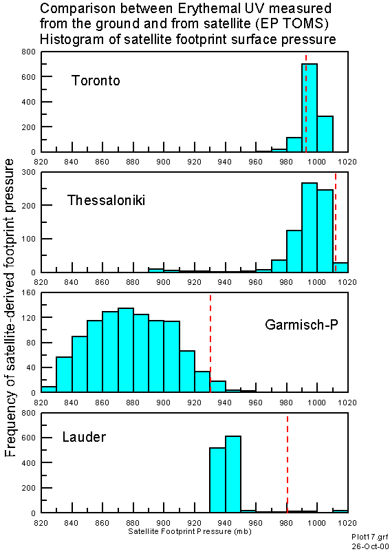
Figure 4. Histogram of satellite footprint pressure. The dotted vertical red lines represent the mean station pressure at each site.
Previous: TOMS Satellite Data Next: Constraining Acceptance Criteria Up: Ext. Abst.