Previous: Data and Methodology Next: Conclusion Up: Ext. Abst.
Results and discussion
The linear distribution fit on ![]() versus O3 is summarised in Table 3 below. A strong linear relationship
between O3 and
versus O3 is summarised in Table 3 below. A strong linear relationship
between O3 and ![]() is depicted. Both the low standard error and the negative slope
(b) of the regression equation is a further confirmation of this
result. This agrees well with theory that
is depicted. Both the low standard error and the negative slope
(b) of the regression equation is a further confirmation of this
result. This agrees well with theory that![]() is inversely proportional to O3 amounts. For both January and September the scatter diagrams
of
is inversely proportional to O3 amounts. For both January and September the scatter diagrams
of ![]() versus O3 (Figures 3a and 3b) show a clear inverse relationship between
the two variables. However, the September scatter diagram portrays
a markedly better defined inverse relationship by the fact that
the points are comparatively more packed together. A further investigation
of this finding could bring a better understanding of the relationship.
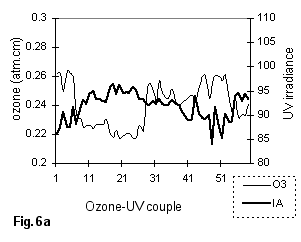
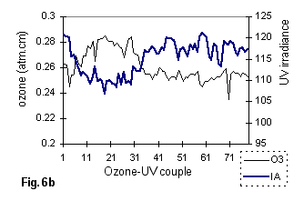
IA spectral irradiance values, generated for both January and September
at 11:30/12:00 are shown in figures 6a and 6b.
versus O3 (Figures 3a and 3b) show a clear inverse relationship between
the two variables. However, the September scatter diagram portrays
a markedly better defined inverse relationship by the fact that
the points are comparatively more packed together. A further investigation
of this finding could bring a better understanding of the relationship.
IA spectral irradiance values, generated for both January and September
at 11:30/12:00 are shown in figures 6a and 6b.
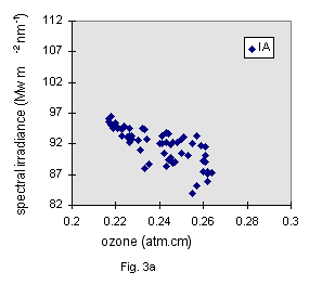
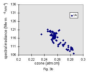
Figures 3a - 3b: January (a) and September (b) scatter plots for![]() versus O3 at 11:30 - 12:00
versus O3 at 11:30 - 12:00
| l pair | IA | IC | f ID | |||||||
| Month |
Jan. am pm |
Sept. |
Jan. am pm |
Sept. |
Jan. am pm |
Sept. | ||||
|
a b |
0.587 -0.581 |
0.612 -0.694 |
0.702 -1.049 |
0.575 -0.111 |
0.564 -0.073 |
0.729 -0.727 |
0.629 0.254 |
0.628 0.251 |
0.827 -0.535 |
|
|
s r |
0.006 0.820 |
0.009 0.735 |
0.007 0.869 |
0.007 0.215 |
0.008 0.138 |
0.006 0.830 |
0.008 0.445 |
0.009 0.386 |
0.006 0.718 |
|
|
Data points
|
40 | 59 | 78 | 40 | 59 | 78 | 40 | 59 | 78 | |
Table 3: Linear distribution fit for ID , IC and ID.
* Coefficients a and b are of the regression equation y = a + bx; s is standard error and r is correlation coefficient.
The regression analysis results of C wavelength pair (Tables 3) show a relatively poor correlation for January. However, The two scatter diagram suggests the presence of two distinct patterns, represented by the two generally outstanding clusters. This could be interpreted as an existence non-linear relationship within the considered time interval. Further investigation into these two clusters will throw some more light into this area.
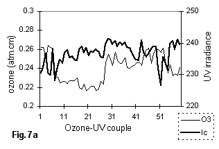
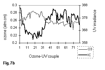
Figures 7a and 7b are a plot of the determined UV spectral irradiances for wavelegth C. The 1994 ozone data period, which had low values, seems to be an outstanding feature for in Figures 7a and 7b. As compared to Figure 6a, the low ozone concentrations in Figure 7a are not accompanied to a marked UV increase. This could be attributed to the fact that UV absorption by ozone becomes less pronounced with increase in wavelength.
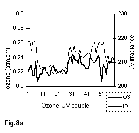
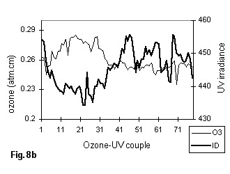
The UV-A wavelength linear distribution fit results (Table 3)
show significant negative correlation between ![]() and O3. Comparing Figures 5a-5b with Figures 3a-3b, where UV irradiance
is strongly absorbed by ozone, the January UV-A scatter diagrams
for January seem to be more scattered than those for UV-B. This
can be explained by the fact that UV-A, as compared to UV-B, is
absorbed less by ozone (Tevini, 1993). The generated irradiance
values are shown in Figures 8a and 8b.
and O3. Comparing Figures 5a-5b with Figures 3a-3b, where UV irradiance
is strongly absorbed by ozone, the January UV-A scatter diagrams
for January seem to be more scattered than those for UV-B. This
can be explained by the fact that UV-A, as compared to UV-B, is
absorbed less by ozone (Tevini, 1993). The generated irradiance
values are shown in Figures 8a and 8b.
The month of September seems to have relatively high UV irradiance values as compared to January: the September r values generally higher than the January ones. This could be attributed to the seasonal march of the sun. A better understanding of this observation could be attained if all the months of the year are studied.
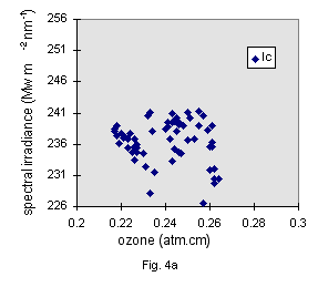
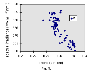
Figures 4a - 4b: January (a) and September (b) scatter plots for![]() versus O3 at 11:30 - 12:00
versus O3 at 11:30 - 12:00
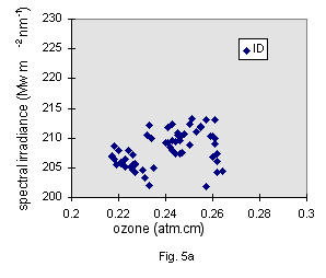
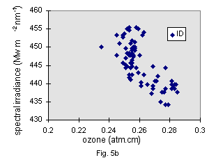
Figures 5a - 5b: January (a) and September (b) scatter plots for![]() versus O3 at 11:30 - 12:00
versus O3 at 11:30 - 12:00