Previous: Model description Next: Conclusions Up: Ext. Abst.
Results and discussion
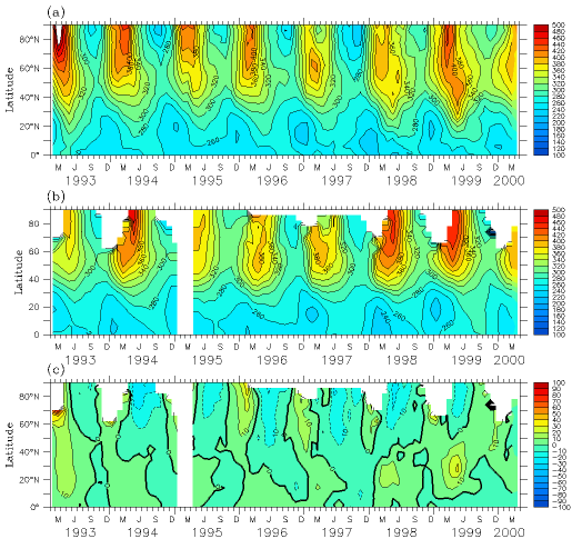
The evaluation of the UIUC SCTM ability to simulate the total ozone is presented in Figures 1 and 2. Figure 1 illustrates that the model mimics well the seasonal behavior of the total ozone over the Northern Hemisphere, the maximum is around 60-70 degree North or on-pole (it depends on the dynamics and stability of the polar vortex) usually in March and minimum in October. In the tropics the model predicts well the low total ozone values here and the minimum of total ozone during boreal winter, when the transport of ozone to the north is prevailing. The overall agreement between simulated and observed total ozone is within 10-12% over high latitudes and better than 10% in the tropics. The most noticeable disagreement is during years 1993 and 1998 when the difference is close to 20%.
|
| Fig.1 Time-latitude cross-section of monthly zonally averaged total ozone simulated by UIUC ACTM (a) in comparison (c) with TOMS data (b). |
Figure 2 presents a comparison of the geographical distributions of the simulated and observed total ozone for the Northern Hemisphere in March 2000 and the Southern Hemisphere in October 1998 for the simulation with the actual CFC concentrations. It is seen that the model reproduces well the geographical pattern of the observed ozone distribution and its maximum and minimum values. A more detailed validation of the model is given by Rozanov et al.(1999b) and Egorova et al. (2000).
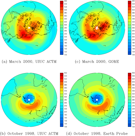 |
| Fig.2 Comparison of the geographical distribution of simulated (a and b) total ozone with observed one by GOME (c) and Earth Probe TOMS (d) satellite instruments in the Northern (March 2000) and Southern (October 1998) Hemispheres. |
To address the above question we have carried out two model simulations with UIUC SCTM: a model run with the actual values of the CFCs concentrations and a model run with the CFCs concentration prescribed according to the WMO (1999) scenario H1 (No Protocol): around 3% annual growth of CFCs constructed for the would-be absence of the Montreal Protocol limitations. These experiments allow to make the direct estimation of the contribution of the Montreal Protocol and its Amendments limitations to the retrieving of ozone level in our days.
Figure 3 presents the year-to-year evolution of the prevented total-ozone destruction (POD) by the MPA in percent since 1996; before this year there are no significant changes. It is clearly seen that the polar regions are the most sensitive to the reduction in the active-chlorine burden. The POD begins to increase noticeably in 1996 over both the northern and southern high-latitudes where the magnitude is about 1.5%. In October 1999 the POD reaches 5% over the South Pole and 2% in March 2000 over the North Pole. The area of the POD gradually spreads out with time and even begins to penetrate into the tropics in 1999. Figure 3 also shows that the reaction to the decrease in active chlorine by the MPA is different in the Northern and Southern Hemispheres. In the Southern Hemisphere there is a noticeable linear time dependence of the POD because in this area, during the winter, the temperature in the lower stratosphere is always low enough to allow the existence of PSCs. In the Northern Hemisphere the time dependence is not linear. During the winters of 1996-1999 the POD is almost the same. The winter of 1996/1997 was relatively cold, but the concentration of active chlorine according to the No-Protocol scenario was small. The winters of 1997/1998 and 1998/1999 were relatively warm, hence heterogeneous processes were not very active. During the winter of 1999/2000 both conditions for the intensification of heterogeneous processes - cold temperature and high stratospheric active chlorine loading - took place, hence a higher POD occurred compared to previous years.
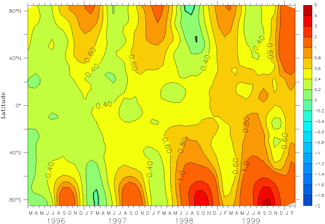 |
| Fig.3 Simulated year-to-year evolution of the total ozone destruction prevented by the MPA according to the No Protocol (H1) scenario. |
Figure 4 displays geographical distribution of the Montreal Protocol effect in percents for March 2000 in the Northern Hemisphere (a, b) and for October 1999 in the Southern Hemisphere (c, d). In the Northern Hemisphere Northern Europe and Central Africa have the biggest beneficial effects of ozone saving up to 2.5% from the Montreal Protocol in spring 2000. In the Southern Hemisphere Antarctic region (5%) and Zambia (2%) were the most sensible regions to chlorine loading in October 1999.
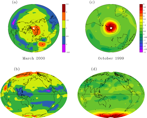 |
| Fig.4 Geographical distribution of the total ozone destruction prevented by the MPA in percent for March 2000 (a and b) and October 1999 (c and d) |
Figure 5 shows the global annual-mean total ozone observed for the satellite era (1979-1999) by pink curve and simulated by the model with (blue curve) and without (red curve) the MPA limitations. It is seen that the global total ozone decreases from 1979 to 1985 and then tends to recover from 1985 to 1989. In 1991 an abrupt total ozone drop occurred as a consequence of the Pinatubo eruption, and thereafter there is a slightly increasing tendency. These positive anomalies cannot be explained by the MPA, because our model shows almost the same positive tendency for the case without the limitations imposed by MPA. Most likely this increasing tendency is caused by the changes in the circulation pattern and/or the decrease of sulfate-aerosol loading following its insertion into the stratosphere in 1991 by the Pinatubo volcano. This indicates that the causes of the pre 1993 ozone decrease should be assessed to elucidate the relative contributions of the anthropogenic influence, circulation pattern and products of volcanic eruptions. Such an assessment requires the development of reanalysis data sets extended at least to the entire stratosphere and covering the time period 1970-2000.
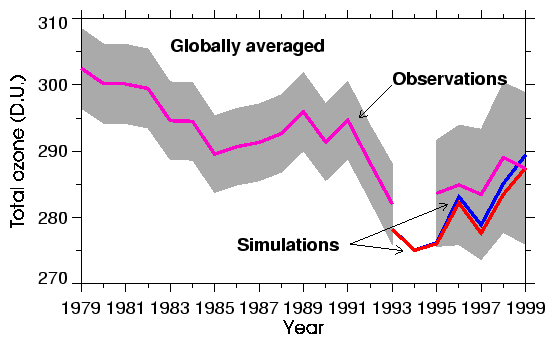 |
| Fig.5 Year-to-year distribution of simulated and observed global annual-mean total ozone for the period 1979 to 1999. Observed values from Nimbus-7, Meteor-3, ADEOS, TOVS, GOME and EP shown by the shaded area. Simulated values shown by the solid line for the actual values of the CFC concentrations and by the dashed line for the No-Protocol (H1) scenario. The observed values is shown by the solid line with asterisks, and the uncertainties of the satellite data are shown by shaded area. The global annual-mean values simulated for the actual values of the CFC concentrations are shown by the solid line with diamonds and for the No-Protocol (H1) scenario shown by the dashed line. |